 727-219-2132
The age of mobile is definitely with us.
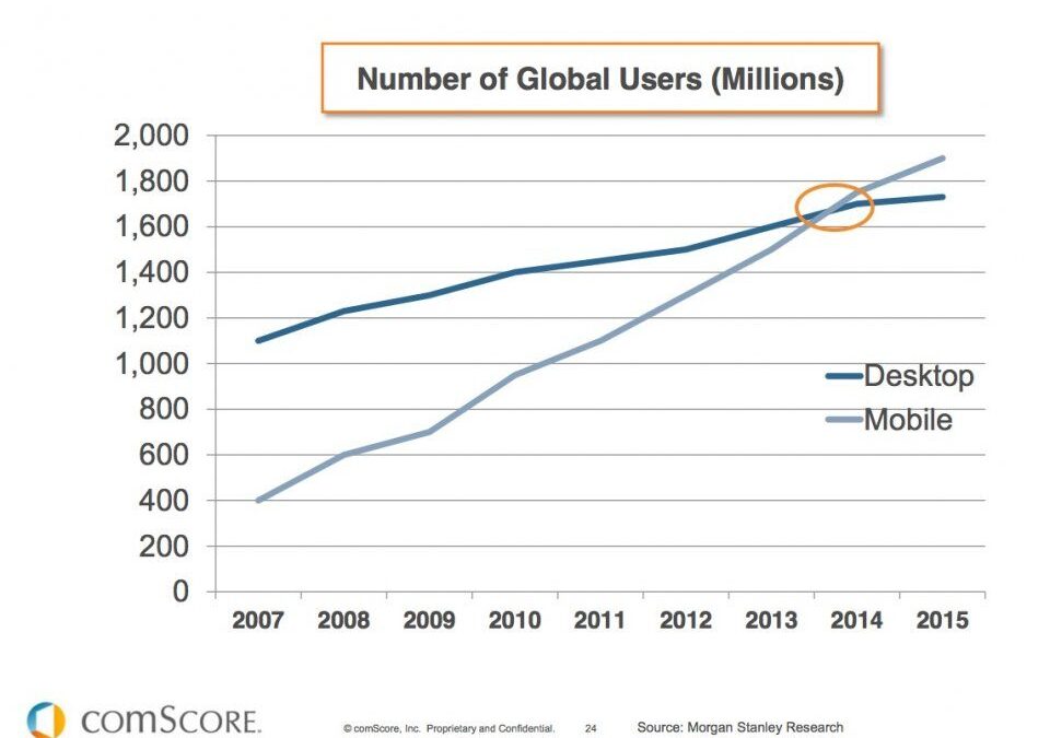
In 2014 the number of mobile users worldwide surpassed desktop users, and in 2015 the number of searches done on mobile devices exceeded those done on a desktop. (comScore) Because of these changes, Google introduced a mobile search ranking update in April 2015 and they’re set to do another one in a month’s time. (May 2016)
These mobile updates make designing a good mobile site essential for businesses that want to compete. According to Google’s Mobile Playbook, 57% of users say they won’t recommend a business with a poorly designed mobile site.
How does your mobile site stack up?
Just passing Google’s mobile-friendly test is not enough.Some brands have a separate mobile site that will pass the test, but both Google and visitors to your mobile site are not finding these old m.brand.com sites easy to access and use. A fully responsive site is the preferred format.
Tips to improve your mobile experience
Know your audience. Design for the way they use your site content. Most mobile users are looking at content on a mobile device while they’re doing something else. Spend time in Google Analytics and find out where your visitors come from, what they do on your website and what they’re looking for.Content must be simple, easy to access and enticing.
Don’t make a separate mobile website. A fully responsive website is designed so that the content is fluid and adapts to the device being used to access the site. It will render the content in the right format for each different device.
Keep the design and the navigation simple. An overcrowded site makes it much harder for a visitor to find what they need. Size and load speed are the two most important measures for a mobile site.
Font and Button Size. Use at least a 14pt font size for text and make your button easy to see and tap. Make it easy for them to read your content and tap your call to action buttons. Remember that most mobile users are on a smartphone and their screen is small.
Use hi-res images. The latest smartphones have high resolution screens that require an image double the resolution of a desktop. The demand for great visual content is growing and it gets a higher engagement rate.So since you can now give your mobile users an excellent visual experience, make sure that you do. You don’t want your images to appear fuzzy or pixelated on the mobile version.
Leverage mobile only features. You can add things like ‘tap to call’ that could only be used on a smartphone and make sharing quick and easy across social channels.
Test, test and test again. See how your content looks on every possible mobile device, not just one or two.Test every page of the site and every action a user would take. Get 10 customers to test it while you watch them. Ask 10 non customers who would fall into your target audience to test it for you.Make notes while they use it.Fix any issues.Then test again.
If this all sounds like a mountain of work and a major headache, schedule a call with our mobile web design team at https://www.studio98.com/
They can take care of it all for you.