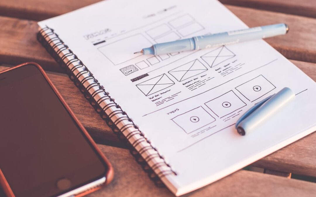
Many people often think that designing mobile websites differs from the desktop design. Well, the truth is that it really isn’t. Nevertheless, screens are usually smaller and rely on touch by users, but most of the fundamental principles of design are still applicable. When designing for mobile browsers, there is a gamut of considerations to keep in mind. In fact, here are six primary elements that every mobile website should possess.
1. Focused Content
Things may not get faster or easier by simply getting rid of taps/clicks. This also means that your mobile design may not be easier to use or operate faster by simply removing content. Removing content between your mobile web page and main website may affect readers. You may be simply removing the content that your readers want to have or need. In a nutshell, you need to concentrate on your content as it can help both the primary website and the mobile designed site. It is a good idea to refocus on non-important content or simply re-purpose it rather than removing any from your website. You can consider the idea of using virtual materials to satisfy text elements. Use negative and padding space to separate or emphasize areas of the text. To break up bigger bits of your content into smaller sizes, simply make use of different views. To emphasize crucial areas, you can make use of highlights. Different elements of your content can be defined by using a light background color. Instead of font size, simply make use of differing header/text colors to make the difference. Using small informative graphics can be used to fortify what is being explained. Instead of just listing the dates, you can use graphics date elements. With the header text, you can use title icons for a better result.
2. Meaningful Navigation
It can be a fun experience when moving from screen to screen on a mobile device. On this note, you should always make your mobile design meaningful and enjoyable. Remember that your mobile application will not be meaningful or operate faster than anticipated by simply getting rid of taps or clicks. The navigation of your mobile website should be a clear route to helping users get to their final destination. This implies finding the relevant information they need on your mobile platform.
3. Clear/Comprehensive Branding
Website developers usually like aesthetically pleasing designs. Although this helps show off their design knowledge and skills, it’s super important to keep the design focused on branding. Branding remains one of the most vital items in any design. For this reason, you should not obliterate the branding of your design. You should always find a space when you can fit in a company’s logo and maintain the key look and feel of your brand.
4. Feedback
Studies have shown mobile users will sometimes crouch their finger over an area of a website without fully touching it. This is similar to the “hover” over state that happens on a desktop site when a user places their mouse over top of a link or element before actually clicking it.
The problem here is that most sites will have animation or a color change, or some kind of feedback, when you hover over elements. But on a mobile device, most sites don’t give any feedback. It is highly important to provide feedback when your mobile device is active or has been touched. Most users expect to see something happen. It’s therefore a good idea make use things like fades or slide animations to signal changing states. You can also make use of a turned arrow when selecting drop downs. Additionally, to symbolize changes in levels, you can use different text colors or buttons. Use subtle gradients and border colors on buttons that respond when touched. You can use fade out and fade in animations when users touch one item or another. You can as well use colors to map out areas that have been activated or selected.
5. Plenty Of Space
This is one of the most important things every mobile design should have. Plenty of space will make your website design easy to use, follow good navigation routes, and display items faster than anticipated. With plenty of space, you can make use of smaller fonts and not larger fonts squished together. Another great way to give your mobile design plenty of space is by enough padding around the entire view. This will help to wrap or cover all items and keep elements from floating off into untouchable or unreachable places. Between every element, you can make use of a clear grid with enough white space to clearly distinguish elements.

