 727-219-2132
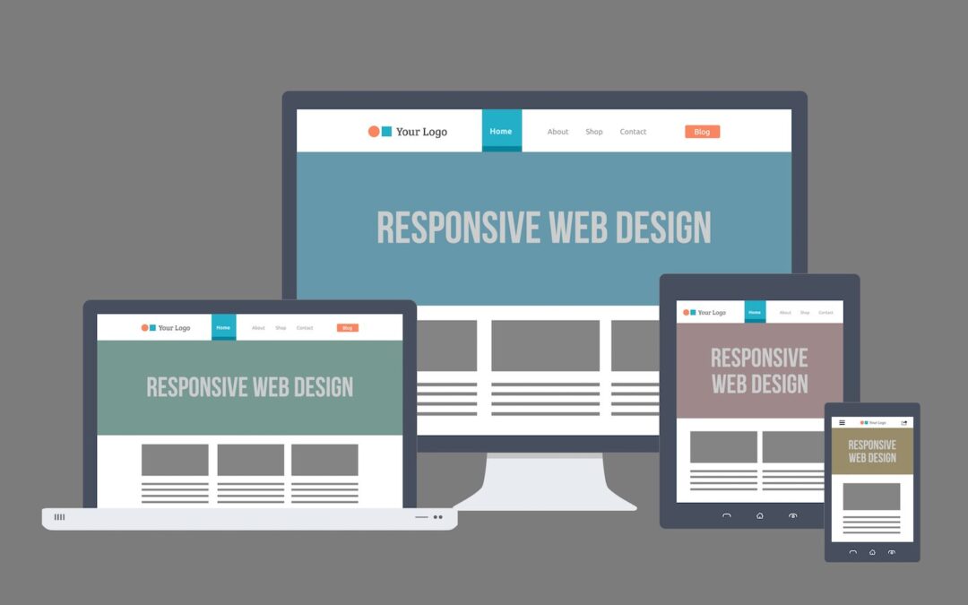
As mobile device technology continues to improve, it is becoming more and more viable to lean on a smartphone as a primary tool for surfing the Internet.This means that a responsive web design (RWD) is absolutely required for any website that hopes to attract and retain web traffic.
Additionally, in our current on-demand economy, consumers are increasingly expecting to conduct ecommerce transactions on their own terms at any time, so any company whose website isn’t optimized for mobile phones or tablets risks losing customers. The site with a pleasant user experience will beat out any competitor that frustrates its users every time, so it’s important that web designers ensure that their sites serve devices of all shapes and sizes effectively.
Both design and development are important in achieving this, so here are some best practices for attaining responsive web design for your website.
Think Mobile First
Since everyone is going mobile these days, it’s best to ensure that you put your best foot forward with a site that’s optimized for mobile. This means re-thinking how you create the website and throw out any processes that run counter to achieving a site that serves screens of varying widths and resolutions.
In addition to visual appeal and optimal readability, a site must also be responsive on all size screens as well – so start out by designing for the smallest display and work your way outward from there. Another way to help accommodate various screens is to use liquid layouts designed for that purpose.
This way, you won’t simply be setup for current parameters of smartphones, tablets and laptops/monitors, but instead able to scale to any screen size effortlessly – allowing you the flexibility to accommodate some unknown intermediate display if a new device type or model suddenly becomes available.
Context is Important
When designing your site to accommodate all these different display sizes, don’t just concentrate on cramming all of your content into the space. Keep in mind the context of why a user would be visiting your site and prioritize that content to match their needs. This is where data on the browsing habits of your users comes in handy.
Knowing what users are looking for most often on different devices can help you mold your user experience design to fit the demands of your audience. Simply fitting all of your content into different layouts can ignore this crucial nuance, which means you could be making your mobile users weed through columns of useless content searching for something they need right away. Establish what data you have or are able to gather on visitor activities as early in the development process as possible to help establish a framework for how you should scale your content.
Optimize Navigation
Ensuring that your users can navigate your site easily and efficiently is a very difficult part of achieving responsive web design. This goes double for bigger, more complex menus. For obvious reasons, the solutions that work best for larger laptop and monitor displays are not always the best choices for smaller screens. So you need to scale your navigation interface to achieve consistent, user-friendly experiences across all presentations of your site – which means that the exact navigation menu can change based on display size. It’s true, altering design aspects of your site is usually a user experience no-no.
However, in this case the goal is to remain as consistent as you can in navigation,including visual presentation and labeling, while not being a slave to maintaining how it actually works or the layout. Instead, aim to maintain the essence so it feels similar even though it functions differently from screen size to screen size.
Real-world Testing
If you’re going through the trouble of optimizing your web design for different devices, you might as well go ahead and field test your site before going live. This will help you understand your users and catch any user interface issues or bottlenecks you may have missed. Items to pay attention to include:
- Input – Input techniques can change from one device to the next, so don’t optimize the design for a mouse when the user will be using a finger to navigate your site. This also means providing larger buttons on smaller screens to accommodate the lower precision of fingers compared to a mouse.
- Typography – The fonts you use can help make or break the user experience on different devices. Whatever typeface you choose, make sure it provides a uniform feel no matter what size display is used.
- Content – Content layout approach should scale along with size to ensure it effectively conveys the intended message. This includes shifting to fewer columns, subtracting images from descriptions and streamlining information presented to make sure that the critical message comes through uncluttered. This can also include changes such as replacing text with icons to accommodate tighter layouts.